Chart Types in Excel 2010
When we display your data visually in Excel 2010, choosing the right type of chart is just as important as deciding to use a chart at all. Different charts display the data in very different ways. Using the best chart type and format will help you display your data visually in the most meaningful way.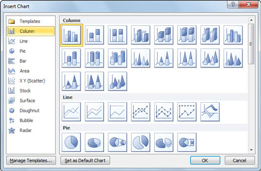
In the Insert Chart dialog box provides access to all the available chart types and subtypes.
- Column charts: A column chart, unlike a bar chart to which it is often compared, emphasizes variation over a period of time. In a column chart, categories appear horizontally and values appear vertically, whereas in a bar chart, categories appear vertically. Variations include the cylinder, cone, and pyramid chart subtypes.
- Line charts: A line chart shows the relationship of the changes in the data over a period of time. Although similar to an area chart, which shows the relative importance of values, the line chart emphasizes trends rather than the amount of change.
- Pie charts: Pie charts contain just one chart data series. A pie chart shows the relationship of the parts to the whole. To emphasize the importance of one slice of the pie, choose one of the exploded 2-D or 3-D pie charts.
- Bar charts: A bar chart (horizontal bars) emphasizes the comparison between items at a fixed period of time. This chart type also includes cylinder, cone, and pyramid subtypes.
- Area charts: An area chart shows the relative importance of values over time. An area chart is similar to a line chart, but because the area between lines is filled in, the area chart emphasizes the magnitude of values more than the line chart does.
- XY (Scatter) charts: Scatter charts are useful for showing a correlation among the data points that may not be easy to see from data alone. An XY (Scatter) chart uses numeric values along both axes instead of values along the vertical axis and categories along the horizontal axis.
- Other Charts: All the other types of charts are lumped together on the drop-down gallery that appears when you click the Other Charts command button on the Ribbon's Insert tab:
- Stock charts: Stock charts are used to plot stock quotes over a certain time period, such as a single business day or week. Stock charts show nearly any combination of a stock's highest and lowest values, its open and close values, and the volume of trade for that stock.
- Surface charts: Surface charts plot trends in values across two dimensions in a continuous curve. In order to use a surface chart, you need at least two data series, both of which are numeric as with an XY (Scatter) chart.
- Doughnut charts: A doughnut chart is similar to a pie chart except for its ability to display more than one data series (pie charts always graph just a single data series).
- Bubble charts: Bubble charts compare sets of three values as kind of a combination of an XY (Scatter) chart with an Area chart. When you build a bubble chart, the size of each bubble represented on the x-y grid represents the third set of values being charted.
- Radar charts: A radar chart shows changes in data relative both to a center point and to each other. This chart type is useful for making relative comparisons among items.


